How can we empower learners through technology?
Overview
In this chapter we’ll be exploring the types of technologies and interventions we can make as users and creators of technology-enabled learning experiences, whether it be recommending the use of specific assistive technologies for our students, or ensuring ensuring access of the materials we create ourselves.
Learning Outcomes
- Consider what technologies can be used to support learners with different abilities.
- Look at a few Assistive technologies
- Apply the basics of web accessibility in web design / web experience
Why is this important?
In this chapter we’ll get into the nuts and bolts of adapting our learning design and technology ‘builds’ to ensure access for all. This is important to consider because there are many different factors involved in doing this work.
Guiding Questions
As you’re reading through these materials, please consider the following questions, and take notes to ensure you understand their answers as you go.
- What have you done in the past to ensure all people can access your digital creations (e.g., powerpoints, word documents, etc.)?
- How many assistive technologies have you used, or do you currently use?
- There these technologies and practices applied ubiquitously where your work or study? Why not?
Key Readings
Aquino, K. C., & BuShell, S. (2020). Device usage and accessible technology needs for post-traditional students in the e-learning environment. The Journal of Continuing Higher Education, 68(2), 101-116.
Savi, C. O., Savenye, W., & Rowland, C. (2008). The effects of implementing web accessibility standards on the success of secondary adolescents. Journal of Educational Multimedia and Hypermedia, 17(3), 387-411.
Empowering through Technology
Aquino and BuShell (2020) found that of half the students surveyed in their study, they perceived that their institution had little understanding of the accessible technology needs of students. This feeds into our previous considerations about the proactive vs. reactive nature of supporting students with different needs. As a result, it’s good for all educators to have a basic understanding and overview of the technical side of supporting all learners, from accessible technologies to how learning materials and technologies can be amended or updated to be more accessible.
Check out the video below, which provides a good overview of making online learning materials accessible hosted by Dr. Sheryl Burgstahler.
Assistive Technologies
Technologies that can support our learning have been around since the advent of technology itself. If you consider the role of early stone tools and hunting and gathering tools, these are obviously tools and technologies designed to assist humans to in completing simple or complicated tasks.
While considering that technology just as easily could be considered paper and pencil, the same is true for assistive technologies. We all use some form of technology make the use of digital systems such as computers, online shopping or online learning easier on us. Whether we use a mouse or trackpad, a keyboard or speech-to-text software all of us have different abilities and preferences that factor into how we use technology and what additional toolsets we can use to make our lives easier, with some of us using more specialised technologies and some of us using more ubiquitous ones.
With this in mind, let’s examine a few hardware (physical) and software (digital) assistive technologies that can support our learners in different ways. It should be noted that as UDL becomes more widespread and movements towards more inclusive use of education and a proactive effort to reduce digital inequity grows, technologies that were once specialised have become more and more commonplace, and become less about supporting users with disabilities and more about ensuring that all users can access and use digital technologies.
As Hemmingsson et al. (2009) found in their investigation of school-aged children with various learning challenges, some students were reluctant to use assistive technologies simply because it made them stand out from their classmates, leading them and others to perceive they were different. Further, how assistive technologies were deployed also played a role, with most technologies not even available to students in the classroom, forcing learners to leave their classmates in order to use them, among other barriers.
Consider: How can we normalise accessibility and accessible technology?
Considering the above, the increase in the use of UDL coupled with the increased celebration of diversity both in terms of cultural background and ability contributes to the ultimate goal of normalising all diversity. What this means is that any lingering stigma, curiosity or novelty surrounding the presence or use of these devices and the people who use them is extinguished, leading to a normalisation of their embedded presence, becoming a benign fact of teaching and learning. Eventually the differences that others choose to point out with the intent to divide become similarities that we all accept without prejudice.
Hardware
Input Devices
There are devices used for controlling computing devices, whether desktop, laptop, tablets or smartphones. Check out the University of Washington’s Accessible Technology Center for pictures all sorts of these devices.
- Mouse and Mouse Alternatives
- Joysticks
- Adaptive Keyboards
- Microphones for voice control
- Eye Tracking – often used in conjunction with software, such as Windows Eye Control.
Output Devices
Devices that provide information outputs from a computing device, as an altnerative to a monitor or screen. Note that sometimes input and output devices can be the same device.
- Braille Displays
Apple provides a list of Braille Displays that work with common iPhone models.
Software
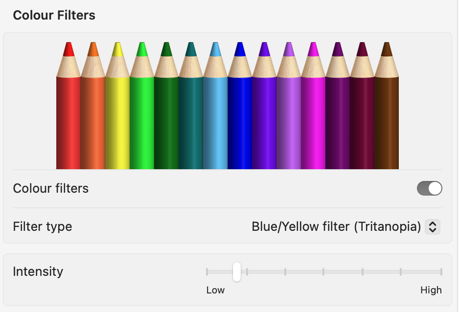
Almost all modern operating systems (e.g., Windows, MacOS, iOS, Android, etc.) have software-based accessibility features, and they have only improved and become more ubiquitous in recent years. Whereas these features were previously 3rd party software that you had to install, they are embedded into operating systems, for the most part. Robinson et al. (2017) outlines that while many users with vision challenges take advantage on Zoom and large text features in Apple iPhones and iPads, they did so without recommendations or training from their respective health care professionals.
- Magnification
- Colorblind Modes
- Text to speech Technologies / Screenreaders
- Microsoft Immersive Reader
- Dragon Naturally Speaking
- JAWS
When text-to-speech is not built in to the websites or technologies we use, screenreader software is an alternative to actually navigating the web as well as using the computer itself, reading out menus and features within the software you use.
Hardware & Software & Input & Output
As previously mentioned, some accessible technologies can be both input and output devices. Tablets for communication are a meaningful technology to support some learners with autism spectrum disorders (ASD), (Hourcade et al., 2012) specifically to support social interaction and development. Ikuta et al. (2019) also detail how noise cancelling headphones and other related devices can support those with ASD, specifically for those with high sensitivity to auditory inputs.
Choosing Learning Technologies
While it may be obvious that there are specific technologies for those with different abilities that help them engage with their learning, never forget that how we choose existing learning technologies is probably the first step in ensuring access to our learners, and potentially presenting barriers to their learning.
Learning Management Systems (LMSs) like Moodle, Canvas, Blackboard Learn, D2L Brightspace, Google Classroom and other technologies should have accessibility features built in as well – if they don’t, these foundational systems will present barriers for our learners. If we’re choosing to use ad-hoc or additional technologies that sit outside what our institutions have set up for us (e.g., Kahoot, Canva, etc.) it’s up to us to assess what technologies we use for accessibility.
Choosing Assistive Technologies
Zabala’s SETT Framework (2005) is one way to think about determining what technology would be a good fit to support students. Before we consider each step in this process, consider that as we explore in the last chapter, there are many actions that instructors and learning designers can take to ensure that using an assistive technology may not even be necessary, including the proactive design of learning materials and activities that are accessible and usable by everyone. Considering this has already been done, the following steps can guide educators in their support of students who may need to use an assistive technology.
- Student refers to who the student is, their capabilities, their strengths and any supports they may need and their motivation to try new technologies that may assist them.
- Environment refers to the learning environment the student is in – namely what technologies they have available to them, common technologies used in the environment they study in, the availability of training for new technologies and the online capabilities they have access to.
- Tasks take note of what the students needs to accomplish to be successful in their learning whether it be related to accessing information, collaborating or communicating with their peers / instructor or working on an assessment task.
- Tools required to complete tasks – from the previous 3 steps, we’ll have conducted a small needs analysis for our student, and will then be able to develop a plan using specific technologies to support them in their studies.
Web Accessibility
W3C or the World Wide Web Consortium, is an international body that has developed standards to ensure all web-based content is accessible to those with different abilities. Their Accessibility Standards help us to ensure that we’re doing everything we can to present content online in away that supports all users.
According to the W3C, “Web accessibility means that websites, tools, and technologies are designed and developed so that people with [different abilities] can use them. More specifically, people can: perceive, understand, navigate, interact with, and contribute to the Web.”
WCAG: Web Content Accessibility Guidelines
The W3C puts out guidelines to help web designers create accessible materials and experiences for the web, the following 4 principles form the foundations of these guidelines (retrieved from Introduction to understanding WCAG)
- Perceivable – Information and user interface components must be presentable to users in ways they can perceive.
- This means that users must be able to perceive the information being presented (it can’t be invisible to all of their senses)
- Operable – User interface components and navigation must be operable.
- This means that users must be able to operate the interface (the interface cannot require interaction that a user cannot perform)
- Understandable – Information and the operation of user interface must be understandable.
- This means that users must be able to understand the information as well as the operation of the user interface (the content or operation cannot be beyond their understanding)
- Robust – Content must be robust enough that it can be interpreted reliably by a wide variety of user agents, including assistive technologies.
- This means that users must be able to access the content as technologies advance (as technologies and user agents evolve, the content should remain accessible)
While there are many resources available to act upon these standards the UK Government’s Digital Home Office provides fantastic text and visual resources (presented in this chapter from a Creative Commons license).
Designing for users of screen readers
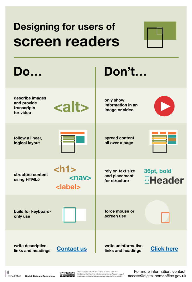
Do
- describe images and provide transcripts for video
- follow a linear, logical layout
- structure content using HTML5
- build for keyboard use only
- write descriptive links and heading – for example, Contact us
Don’t
- only show information in an image or video
- spread content all over a page
- rely on text size and placement for structure
- force mouse or screen use
- write uninformative links and heading – for example, Click here
Designing for users with low vision
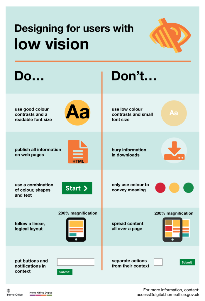
Do
- use good contrasts and a readable font size
- publish all information on web pages (HTML)
- use a combination of colour, shapes and text
- follow a linear, logical layout -and ensure text flows and is visible when text is magnified to 200%
- put buttons and notifications in context
Don’t
- use low colour contrasts and small font size
- bury information in downloads
- only use colour to convey meaning
- spread content all over a page -and force user to scroll horizontally when text is magnified to 200%
- separate actions from their context
Designing for users with physical or motor disabilities
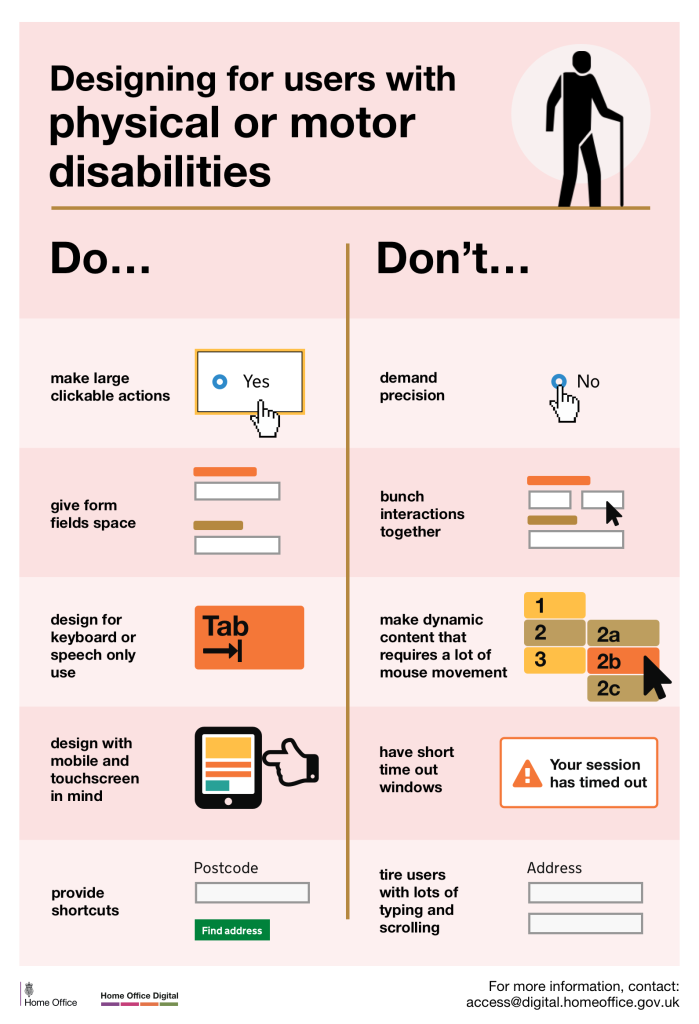
Do
- make large clickable actions
- give form fields space
- design for keyboard or speech only use
- design with mobile and touch screen in mind
- provide shortcuts
Don’t
- demand precision
- bunch interactions together
- make dynamic content that requires a lot of mouse movement
- have short time out windows
- tire users with lots of typing and scrolling
Designing for users who are D/deaf or hard of hearing
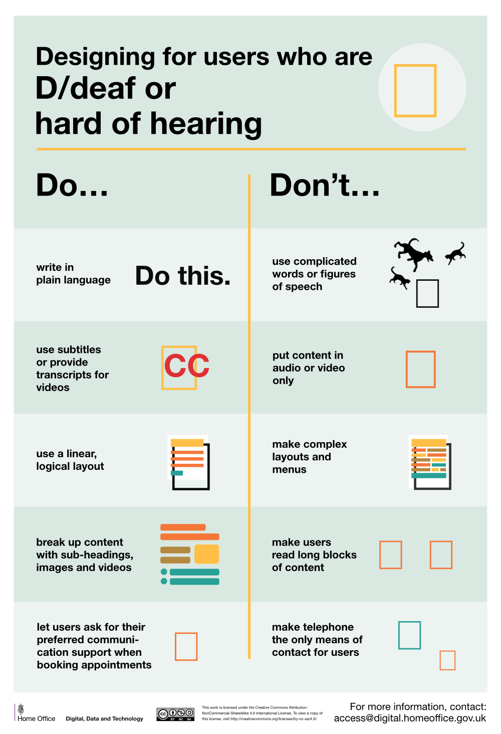
Do
- write in plain English
- use subtitles or provide transcripts for video
- use a linear, logical layout
- break up content with sub-headings, images and videos
- let users ask for their preferred communication support when booking appointments
Don’t
- use complicated words or figures of speech
- put content in audio or video only
- make complex layouts and menus
- make users read long blocks of content
- don’t make telephone the only means of contact for users
Designing for users with dyslexia
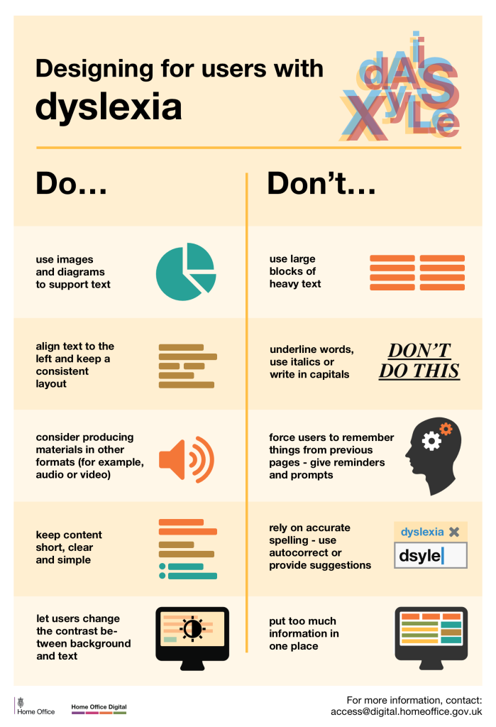
Do
- use images and diagrams to support text
- align text to the left and keep a consistent layout
- consider producing materials in other formats (for example, audio and video)
- keep content short, clear and simple
- let users change the contrast between background and text
Don’t
- use large blocks of heavy text
- underline words, use italics or write capitals
- force users to remember things from previous pages – give reminders and prompts
- rely on accurate spelling – use autocorrect or provide suggestions
- put too much information in one place
Designing for users on the autistic spectrum
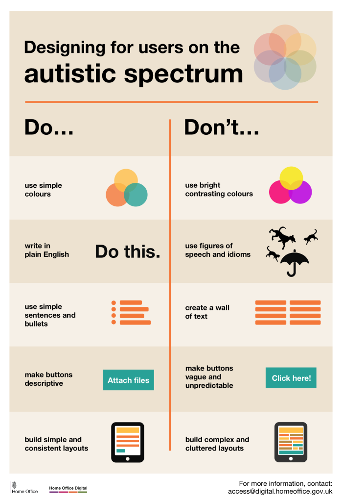
Do
- use simple colours
- write in plain English
- use simple sentences and bullets
- make buttons descriptive – for example, Attach files
- build simple and consistent layouts
Don’t
- use bright contrasting colours
- use figures of speech and idioms
- create a wall of text
- make buttons vague and unpredictable – for example, Click here
- build complex and cluttered layouts
WCAG and Common Learning Technologies
When applying the principles outlined in WCAG, we know that we are not all web designers or developers working with code and programming websites from scratch. For this reason, we should consider all guidelines within the context of the tools we use, and their affordances for allowing us to make content accessible, even down to the technologies we select. The video below features students speaking about some of the barriers they encounter with common learning technologies and content delivery methods.
With the above guidance in mind, here are a few other recommendations you can check out that are more common to the tools we use.
Text
- Use styles (e.g., Header 1, 2, 3, and not hard-coded font sizes (e.g., 12pt font)
- Headers to create structure of a site (H1 > H6)
- Use actual lists instead of dashes or stars
- Try to avoid low contrast and ‘obnoxious colours’ in your text.
- Consider how text content vs. visuals affect how easy the consumption of complex information is (tables of data, graphs, etc.)
Images
- Use Alt text to describe images – how this is done will depend on what technology you’re using
- Alt Text describes what is seen in the picture. Note that this should be descriptive – a good exercise when writing these is to look at the image, then close your eyes and imagine how you’d verbally describe it to someone who couldn’t see it in detail. This allows for more meaningful Alt text (e.g., “Dog” vs. “Dog jumping in the air to catch water sprayed from a hose in a park”).
- Avoid using images with text IN the images – this text is not readable by screenreaders, nor is it picked up by built-in text to speech software on the web.
- If using stylised banners with words you can…
- Use alt tags to ensure the words in the graphics are presented equitably
- Add actual text below the image
- Be mindful of people with differences in colour perception
- You can tag an image as ‘decorative’ if image actually doesn’t add to the content’s meaning (like an icon)
Video
- Subtitles vs. Closed Captions
- Subtitles show only spoken or signed dialogue
- Closed Captions show dialogue as well as descriptions of noises and ambient sounds
- Autogenerated Captions: Many video platforms can do this (as of 2022), and do it really well.
- Manual – Most video platforms allow for uploading a text file of captions, or if you ‘own’ the video, you can edit the captions using the online tools (YouTube, Kaltura, etc.)
- LIVE: Zoom (an other tools) allow for live captioning.
- Many live captioning options for live online meetings is computer generated (using Artificial intelligence), so may not be reliable or may not capture those with non-dominant accents.
- Human-generated live captioning may also be available through Accessibility offices
- Transcripts are a good alternative to captions
- Descriptive Audio (DA)
- Audio track that includes both spoken dialogue AND audio descriptions of what is happening on screen.
- Considerations for Audio
- Video: Is it pre-recorded or Live?
- Ownership: If we don’t ‘own’ YouTube videos, we can’t edit captions, so a transcript is the best we can do.
Documents
- In almost all word processors (word, pages, docs), if using styles (headers) and image tags can create an accessible document that is screen-readable, such as Word Documents and PDFs
Presentations
- Presentation software also allows for headings, Alt tags and other accessibility features, but depend on the software
Design for Mobile
- ‘Responsive’ presentation, meaning the technology will adjust presentation for mobile devices such as smartphones and tablets.
- Use smaller files / videos
- Consider alternatives to high-bandwidth digital content
Considerations
- Embedded Web Content: iFrames, including embedded websites in other websites sometimes aren’t accessible because the web browser doesn’t see them as a ‘native’ piece of content.
- Live Captioning and AI: While live and automatic captioning is pretty good these days, there are some challenges as it has trouble with non-dominant accents, and overlapping ambient noise.
Accessibility Checklists and Technologies
We are not alone in our responsibility to ensure that what we create is accessible to all students. There are many tools available to us to help check our work and guide whatever improvements we wish to make.
First there are checklists – documents or websites that can help us to proactively think about what we’re doing, and manually check our work. A good example is the University of Washington’s DoIT Centre Checklist. This reflective checklist is based on the WCAG’s 4 principles outlined above, and provide a solid reflective framework for looking at our own work.
Another type of support is a web-based Accessibility Checker, and these can come in two forms. First there is an open web checker, one that takes a URL (web address) and allows us to check how our websites fares in terms of accessibility. Check out a couple of example tools below.
- Wave Web Accessibility Evaluation tool does a great job of overlaying issues it finds on websites, identifying structural elements in your content, as well as providing flags for what needs to be fixed.
- W3C has its own website accessibility validator that will check the accessibility of a website or webpage, however this validates websites from a purely technical standpoint, as if you were developing a website using HTML code.
Be aware that many of these tools may not work for non-public websites that are behind a password, in which case, accessibility checker technologies that are built into the technologies we use will be a better choice.
When it comes to using software, many tools now have accessibility checkers built in, such as those provided in Microsoft’s Office Suite of products, including Word, Excel, PowerPoint, etc.
When using an LMS (Learning Management System) or VLE (Virtual Learning Environment), many of these platforms include built-in accessibility checkers, either in text editors, or deeply embedded into the platform itself. One such technology that falls into the latter category is Blackboard Ally, an embedded technology ‘plug-in’ that will check an entire piece of learning content for accessibility, then provide a rating and recommendations for improvement, checking everything from text structures, image Alt tags, and videos.
Learner Agency
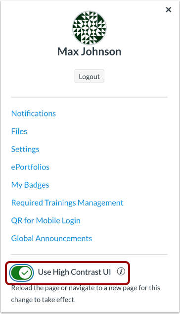
It should be noted that while there is much educators can do to ensure their learning materials, activities and assessments are accessible from a technical perspective, there is also lots a learner can do to accomodate for themselves. As Moriya et al. (2020) found, learners will often self-accomodate, meaning they will adjust the learning environment to suite their own needs based on their own self-understandings. For example, some learners may use noise cancelling headphones to create a quieter study environment for themselves, or may use online translation software to study in a language that is not their primary language. Others may adjust the size of web-based texts using browser settings, or turn on ‘high contrast’ modes within learning platforms to make access easier for themselves.
Despite this common practice among students, we also need to consider this a digital literacy issue – that some students may not be aware of the tools that are available to them, so it would be to their advantage that instructors remind them that these features are available. For example, did you know that this online textbook allows for alternate colour themes, and display in a dyslexic friendly font? Check ou the left panel below the table of contents!
Key Take-Aways
- Assistive Technologies are becoming more ubiquitous, but some specific technologies are still used by those with less common learning needs
- Web design Accessibility standards provide an easy way to ensure that all learners can access digital materials
- There are a number of techniques and tools that allow us to assess our own Accessibility work
Revisit Guiding Questions
Whew! All of this sounds like a lot of work, doesn’t it? As you consider the guiding questions from the top of the chapter, we should think about what the work involved in ensuring our materials and classes are accessible to all learners will mean for our learners. Will it be noticed? We also need to be mindful of the workload issues around this, and whether our organisations or supervisors actually build in time for us to do this work, provide professional learning opportunities on how to do this work, or whether this work is ‘outsourced’ to other colleagues
References
Hashey, A. I., & Stahl, S. (2014). Making online learning accessible for students with disabilities. Teaching exceptional children, 46(5), 70-78.
Hemmingsson, H., Lidström, H., & Nygård, L. (2009). Use of assistive technology devices in mainstream schools: students’ perspective. The American Journal of Occupational Therapy, 63(4), 463-472.
Hourcade, J. P., Bullock-Rest, N. E., & Hansen, T. E. (2012). Multitouch tablet applications and activities to enhance the social skills of children with autism spectrum disorders. Personal and ubiquitous computing, 16(2), 157-168.
Ikuta, N., Iwanaga, R., Tokunaga, A., Nakane, H., Tanaka, K., & Tanaka, G. (2016). Effectiveness of earmuffs and noise-cancelling headphones for coping with hyper-reactivity to auditory stimuli in children with Autism Spectrum Disorder: a preliminary study. Hong Kong Journal of Occupational Therapy, 28(1), 24-32.
Meiselwitz, G., & Sadera, W. (2008). Investigating the connection between usability and learning outcomes in online learning environments. Journal of Online Learning and Teaching, 4(2), 9.
Moriya, R., Reimann, A., Moriya, S., & Sato, R. (2020). Improving accessibility: Developing learner
agency. In P. Clements, A. Krause, & R. Gentry (Eds.), Teacher efficacy, learner agency. Tokyo: JALT.
https://doi.org/10.37546/JALTPCP2019-11
Robinson, J. L., Braimah Avery, V., Chun, R., Pusateri, G., & Jay, W. M. (2017, March). Usage of accessibility options for the iPhone and iPad in a visually impaired population. In Seminars in Ophthalmology (Vol. 32, No. 2, pp. 163-171). Taylor & Francis.
United Kingdom Digital Home Office Do’s and Don’ts of Designing for Accessibility (2016). Retrieved from https://accessibility.blog.gov.uk/2016/09/02/dos-and-donts-on-designing-for-accessibility/.
Zabala, J. S. (2005). Ready, SETT, go! Getting started with the SETT framework. Closing the Gap, 23(6), 1-3.
Further Reading
LX Accessible Content Practices (UTS)
Google: Accessibility for Every Student
How to Design for Accessibility (British Broadcasting Corporation, BBC)
Did this chapter help you learn?
No one has voted on this resource yet.
Provide Feedback on this Chapter